Published
Harbour Magazine - Print Rigors for the Web.
Harbour Magazine launched in print in 2018 as a biannual journal of culture, architecture, and ideas.

Samuel
Admin

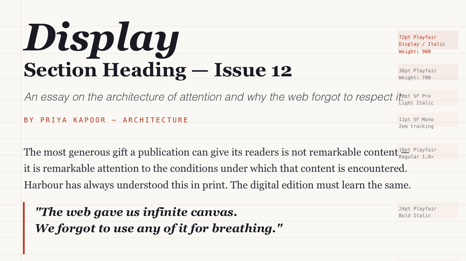
The Typographic System
Every decision in the Harbour redesign began with typography, because typography is the primary design material of an editorial website. Not photography, not colour, not layout type.
The reading experience is, at its core, a typographic experience, and the quality of that experience is determined before a single word is read by the size, weight, spacing, and rhythm of the letterforms themselves.
I built the Harbour type system around a single principle: every typographic decision must serve the reader, not the designer.
This meant rejecting several directions I was personally drawn to a compressed geometric sans that photographed beautifully in mockups but proved exhausting in extended body copy; an ornate display face that communicated editorial ambition but competed with the content it framed.
Reading Analytics
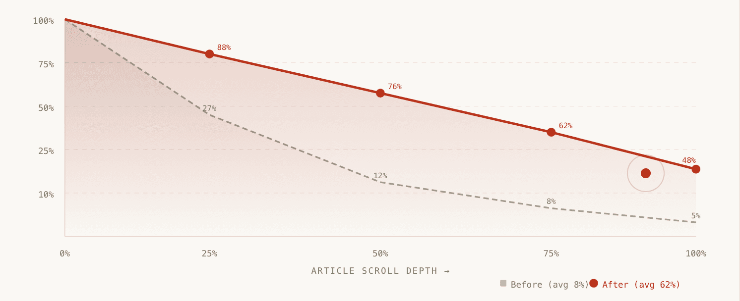
Before the redesign, Harbour's analytics told a bleak story: 73% of visitors left within 90 seconds. Of those who stayed longer, fewer than 12% reached the halfway point of an article.
The most read article in Harbour's digital history had a completion rate of 23% — for a 1,800-word piece that took six months to report and write.
Results & Impact
Reading completion | Time on page | Subscriber growth |
|---|---|---|
4X | 82% | 67% |
5% → 48% full-read | 102s → 8min 34s avg | Year-on-year digital |
What I Learned
Harbour taught me that reading is a designed behaviour. It doesn't happen automatically just because words exist on a page. It has to be invited, structured, and rewarded through line length that prevents eye fatigue, leading to a rhythm, contrast that doesn't strain, and hierarchy that tells the eye where to go next without making it work for the information.
When those conditions are met, readers read. When they aren't, they leave. The content is almost irrelevant to the mechanics of that decision.
The second lesson: the biggest improvements in reading engagement came not from what I added to the page, but what I removed.
The sidebar with trending articles. The mid-article email capture. The related stories interrupt. The floating share buttons.
Every element that competed with the article for the reader's attention was an element that reduced reading. The best editorial design is the design the reader doesn't notice — because they're too busy reading.
Final Thought
Editor-in-Chief Aron Smith commissioned this project with a specific ambition: to create a digital reading experience that earns the same quality of attention as the print edition.
Not a website that presented Harbour's content, but a website that was itself a piece of Harbour's editorial design.


